13 Aug What can we take from this Regency original interior design into our homes?
My recent visit to the Sir John Soane Museum was specifically with this question in mind. Can the interiors of this great example of original regency style translate into what we consider to be style and beauty worthy of our homes today? Regency original interior design in a modern setting – what’s feasible?
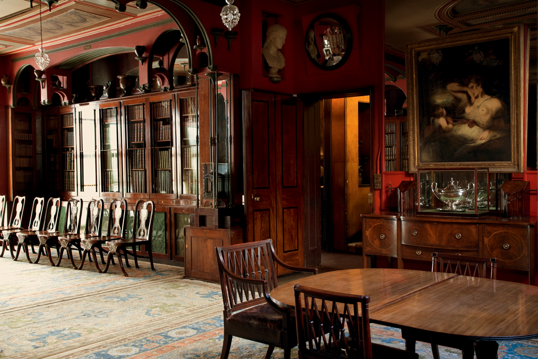
Take for example the drawing room, painted in a deep and vibrant red, now named ‘Pompeian Red’ since he copied the colour from a fragment of wall plaster which he pocketed when visiting the excavations in Pompeii.
This shade of red is enormously popular today to incorporate Regency original interior design. Its vibrancy and warmth are great for dining rooms (especially since its thought to stimulate the appetite) and cosy rooms where you might enjoy a fireside chat. Its impact can create contrast and drama if used on feature walls whilst used as a contrast to something as clean as white it takes on a really fresh feel.
For a red paint product in the same shade go to the heritage paints of Little Greene Company and see the Baked Cherry colour. http://www.littlegreene.com/paint/colour/red-and-pink-paint/red-paint
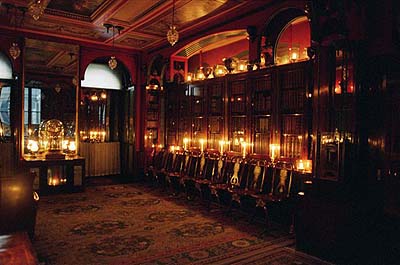
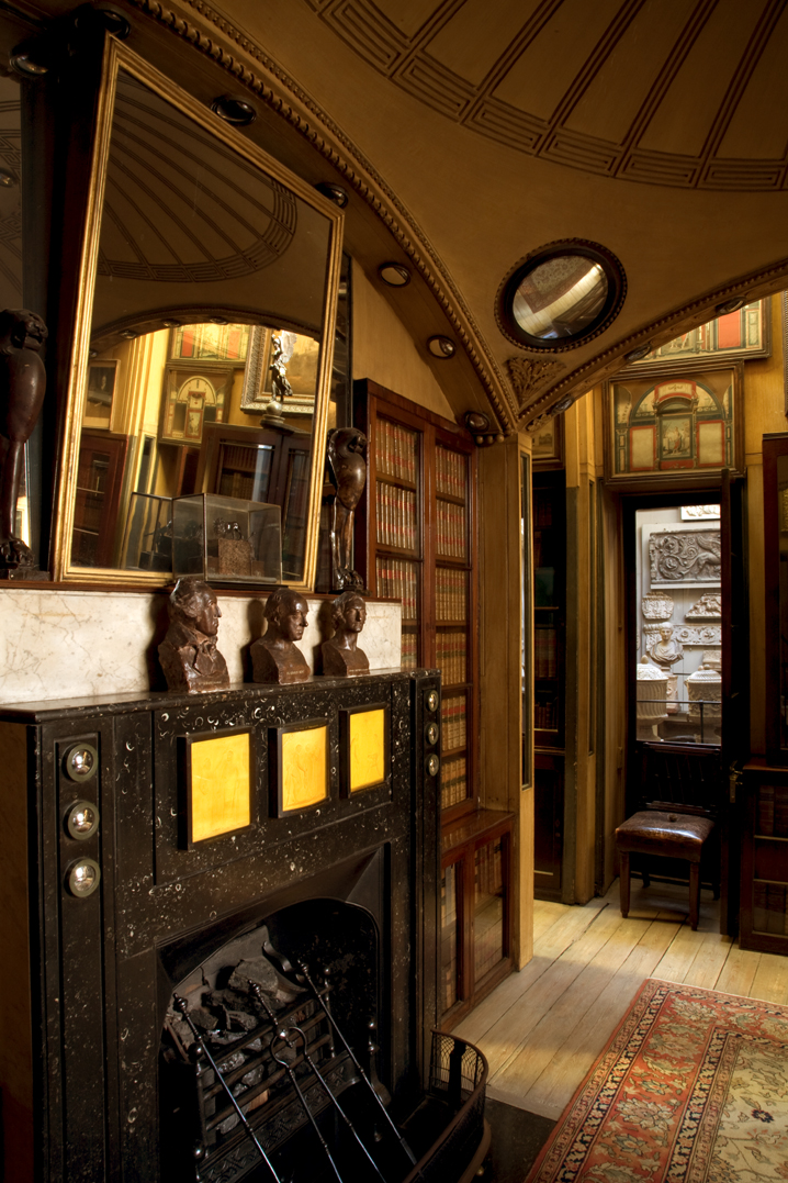
Also remarkable in this room, and in the Breakfast Parlour, is Soanes’ use of many mirrors. By placing mirrors on the walls between the tops of bookcases and the underside of arched alcoves he created the sense that you were looking through to rooms next door. By covering the back of the rooms’ window shutters with mirrors he extended the perceived length of the room and reflected candle and later gas lights back into the room at night when the shutters were closed. It must have been a wonderful room to be in after dark.
You can use mirrors to great effect, creating optical illusions and changing the feel of a space completely. Mirrors can be used to open up a small space, creating the illusion that the room is much larger than it actually is. Use large-scale mirrors in small rooms or balance out poor proportions using mirrors in odd shaped rooms.
The Breakfast Parlour
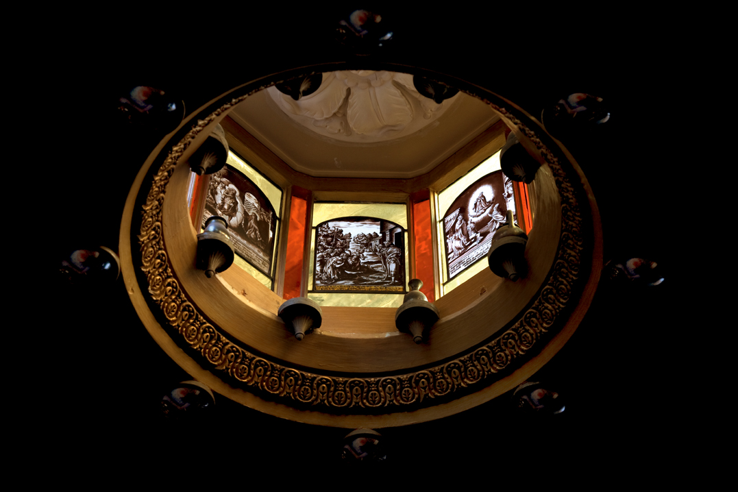
In the Breakfast Parlour the shallow canopy dome ceiling, a Soane trademark, is particularly striking with coloured light cast into the room by concealed skylights at the dome’s peak. Added to this the use of more than 100 pieces of mirror and moveable elements creates a really charming, or as Soane described it ‘fanciful’ effect. It was this kind of treatment that Soane believed constituted the ‘poetry of architecture’.
Looking at a room to see what surprises and tricks of the eye might be created can re-create this kind of magic. Think about the introduction of natural light via skylights, coloured light via contemporary stained glass or LED’s and reflective finishes such as fragments of mirrors, metallic wall coverings and pearlescent mosaic tiling.
The Picture Room
Another example of Soane’s genius, both magical and imaginative, is the Picture Room.
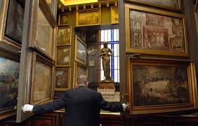
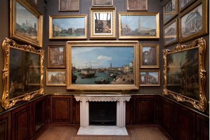
The picture room is top-lit by skylights. The room is only 13ft 8in. in length and 12ft 4 in. in breadth (416.6cm x 375.9cm) and yet it contains a total of more than one hundred pictures, some as large as the Canaletto hanging above the fireplace which measures 4ft 1in. high by 6ft 7in. wide (126.2cm x 204.6cm). This is achieved through the construct of hinged panels or screens that open up to reveal yet more pictures behind them.

The planes on either side of the room open up and pin back to reveal more masterpieces including Rakes Progress
For those who are lucky enough to have a collection of art, but not enough space in which to display them, this would be impressive and uses a relatively small space in your house. Where some like to take people on a tour of their wine cellar, very few guests would expect to view of a mini art gallery. If your collection is not large enough to warrant it then consider hanging a collection of family photos, framed cartoons, or a collection of prints, large and small, together on a wall to create a collective work of art.
Another take on the clever construct of this room is the use of moveable planes to conceal parts of your house which you wish to keep private. or where you need a space to work in different ways at different times. For example using a screen to divide one room into two but that can be folded back against a single wall when the you wish to use the two rooms as one. The picture room demonstrates that this can work equally as well in a period house as in a modernist cube.
The South Drawing Room on the first floor
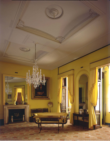
This is a room that I immediately understand as a high fashion statement of the day. Painted in Turners Patent Yellow it has matching yellow taffeta curtains, edged with crimson trimmings, and a yellow regency chaise. This is the equivalent of the striking colours found in copies of Elle Decoration today. See The Little Greene Company’s Mister David
There are so many elements of this room that I admire; I love the rooms’ structure.
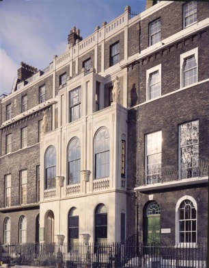
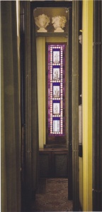
The west wall is oval shaped and along the south wall the addition of a glazed loggia across the three Georgian windows and their original balconies adds a further dimension to the room. You can walk through the curtains, which remain in the location of the original windows, through into the extended area between them and the new windows. It feels like a pillared walkway, each pillar is in effect a bookcase built within the original external wall. Archways reach across from their tops to the new external wall for you to walk beneath and at either end of the extension is an elegant, tall window of stained glass.
It’s a common misconception that interior designers simply deal with colours, fabrics and furniture. In fact, they are trained to consider the internal layout of a room from the location of doorways to the addition of pillars and alcoves as well as built in bookcases and the layout of furniture. Houses need to be able to evolve. Often it’s a case of re-instating features that once existed but don’t be afraid to sympathetically add and adapt to suit your tastes and usage of a room.
The particularly refined ceiling with its shallow ‘domical compartments’ and runs of bead moulding is a design which could look extremely elegant in a country house or even a newly built mansion today.
Soane and his contemporaries recognized that the ceiling is a fundamental feature that contributes to the overall presentation and feel of a house. Whilst his more colourful decorative ceilings are considered too cluttered and heavy for today’s interiors the ceiling in this room is to be admired. The main issue with ceilings these days is that they are rarely given much consideration at all. While a ceiling takes up the same space as the floor, few people spend even a fraction of their decorating budget on creating beautiful ceiling.
Most interior ceilings are flat, mirroring the image of the floor in size and shape. If your ceiling isn’t flat or symmetrical, consider correcting it. If you have a gable roof with exposed interior beams, the symmetry of one part answering to the other is visually pleasing. The slopes of the ceiling can be painted in contrast with the wall color to give both wall and ceiling definition. You can make your ceiling design more fascinating by creating ceiling illusions. If you have unavoidable structural elements as part of your ceiling, such as air conditioning ducts or beams in awkward places, make them part of the rooms color scheme rather than trying to hide them, because that often draws more attention to the problem.
There are many beautiful products available today including ceiling medallions, coving, beautiful moldings and ceiling domes. It is important with any period home to do your research and ensure that you stick to the right proportions and decorative styles. Great books to read on this is Paint & Paper by David Oliver and The Elements of Style by Stephen Calloway and Elizabeth Cromley
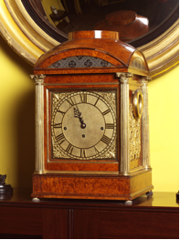
Finally, I noticed the walnut carriage clock sitting above the fireplace. An exquisite piece, it was made by Thwaites and Reed in 1816 and is housed in a case designed by Soane. Beautiful pieces of furniture and ornament will always carry muster in the interiors of today. Whether your décor is contemporary or classic consider cherry picking a few antiques or even commissioning a piece for an understated but extremely personal touch.
There is no doubt in my mind that we can all take valuable insight from the interior designs created by Sir John Soane. He was an innovator of his day and a master at creating his ‘fanciful effects’. Anyone who owns a Regency or Georgian home should visit the Soane Museum for inspiration and do get in touch with us at Etons of Bath if you’d like to implement any of the ideas of designs you see into your own home.


No Comments